Posted in Color, fiber festivals, knitting, The Creative Process, The Design Process, yarn

2016 – Possibilities

The last six weeks have been a whirlwind.  Finally now I’ve enjoyed a few moments to catch my breath, to reflect, and to look forward to possibilities for the new year.  Not to go into too much detail right now, as the upcoming designs are still shadowy and lurking around in my brain, waiting to take form…but I wanted to share with you the palettes I will be playing with…and I’m sure that other ideas will crowd in and push some of these further down the line, but for now, here are some possibilities for 2016.

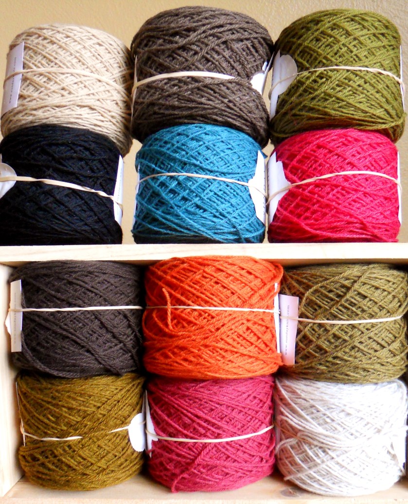
These are a few of the skeins I picked up at the Columbia Gorge Fiber Festival in November.  I believe they will become a two-color yoked sweater, with the green as the main color.  I haven’t decided whether the yoke will be striped, a stranded design, or some sort of mosaic knitting.  I’m sort of picturing a honeycomb type of pattern using slipped stitches for the yoke – maybe.

yarn haul

These yarns are also set aside for sweaters, perhaps with a lace or cable panel.  I couldn’t decide on color, so picked up both:

DSCN8703

DSCN8698

I also want to experiment with an allover lace pattern for this lovely Shibui yarn.  You can see the ready-to-wear sweater that’s inspiring me in the upper corner.  I may or may not knit the linen and the mohair together.  The colors are amazing in real life.

DSCN8716

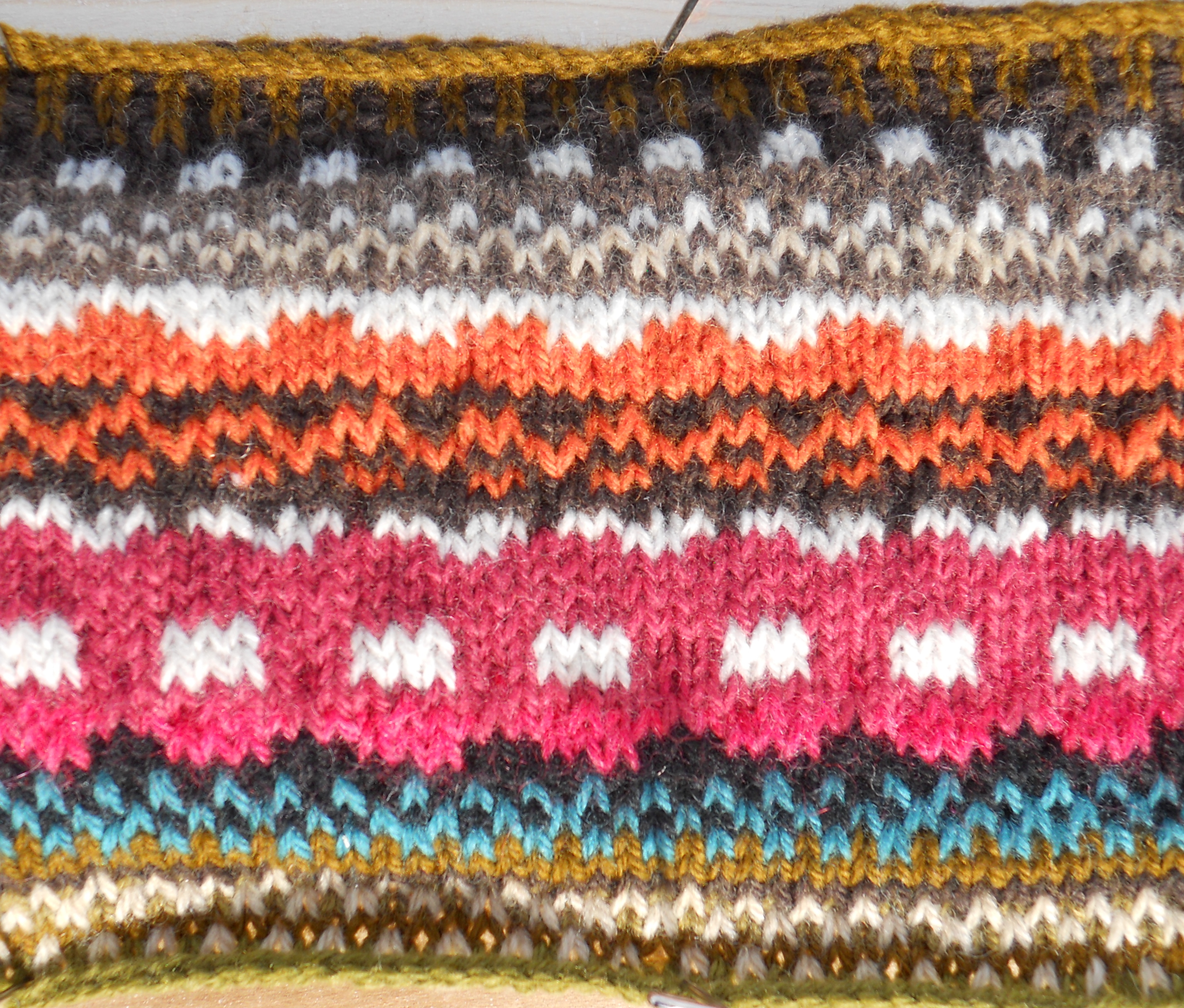
And I am so thrilled to be working on the colorwork tee again.  Christmas knitting, among other things, took me away from it.  But I’m back!  And my tension is more even now.  Woot!  I am hopeful that testing can begin on it once I have placed the sleeves on waste yarn and joined for the body.

DSCN8727

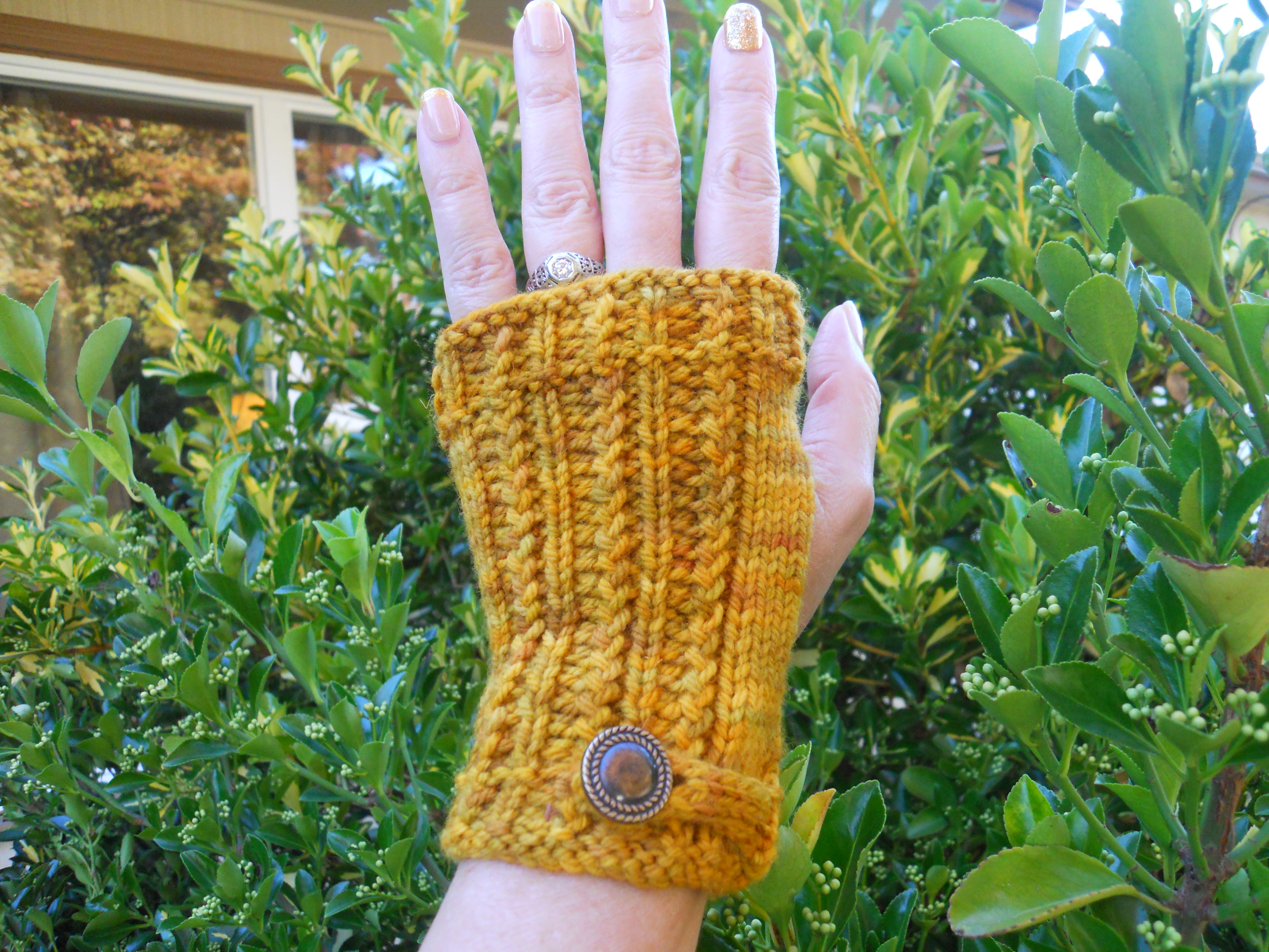
Other possibilities: fingerless mitts related to the colorwork tee, fingerless mitts inspired by this design inspiration session with friend and fellow designer Marie Greene, a pencil skirt related to the The Wayfarer Hat and the Passport Mitts, and, possibly, a cabled home decor project using Weston Hill Farm cottage spun yarn.

On a related note, I am hoping to attend Rhinebeck New York Sheep and Wool Festival in October and the Columbia Gorge Fiber Festival in November.  I have written before on how wonderful fiber festivals are: Fiber Festivals as Travel Destinations.  I hope also to hit the Rose City Yarn Crawl March 3-6 and the Blue Moon Fiber Arts Barn Sale this summer.

I would love to hear from you if any of the above colorways/palettes speak to you.  And are you planning to attend any fiber-related events this year?  So many possibilities!

Posted in The Design Process

An Online Advent Calendar – Creative, Uplifting

Holly and Snow (2)
unsplash.com, used by permission.

I’m getting into the holiday spirit – and being helped by a lovely, fun and unique advent calendar, the 2015 Jacquie Lawson Advent Calendar.  A dear friend gifted it to me, and I’m loving it!  It is a downloadable app for PC or iPad, and each day there is something new to unlock.  The theme is Victoriana; the scene, a Victorian village. A Christmas playlist, designing your own snowflakes, decorating Christmas trees, and a game in which you break ornaments are a few of the features I have found so far.  I love the design element of this application – the artistic and creative ways that someone applied her gifts to create something new.  This is designed by a team, actually, but that makes it no less creative, to my view.

I hope you will go check out the demo video.  This is a great Christmas gift idea – very reasonably priced, unique, and uplifting!

Posted in Color

Pantone Announces 2016 Color of the Year

Sarah's yarn

MEGS COWL

Pantone has announced its 2016 Color of the Year: Rose Quartz & Serenity.  The Color of the Year is a big deal for the design community, so expect to see it in ready-to-wear, housewares, paint colors, yarn, even your nail wraps!  Recent Colors of the Year have been Marsala (2015), Radiant Orchid (2014), Emerald (2013) and Tangerine Tango (2012).

For the first time, Pantone has blended two colors, a soft pink and a tranquil blue.

Joined together Rose Quartz and Serenity demonstrate an inherent balance between a warmer embracing rose tone and the cooler tranquil blue, reflecting connection and wellness as well as a soothing sense of order and peace.

-Leatrice Eisemen Executive Director, Pantone Color Institute

You can even download Color of the Year Wallpaper for your desktop!

What I find interesting are the Rose Quartz & Serenity Color Pairings.  (Scroll about halfway down the page.)  As you know, I love looking for pleasing color palettes.  I think I would throw in some warmer or richer colors.  Hmm…that sort of sounds like a personal challenge!

I have been drawn to these colors throughout 2015, as you can tell by the yarns I chose as prizes for our most recent knit-a-long!


It will be very interesting to see what happens with this color combination over the next year.

Posted in design, In The Wind Yarns, inspiration, knitting, knitting patterns, Oregon, pattern, Salishan, The Creative Process, The Design Process, Uncategorized

Salishan Cowl: A Look into the Design Process

The Salishan Cowl is another pattern which lends itself to a look into the design process. In this case, it was a matter of being immersed in a place as well as spending time pondering the building blocks of knit design, the stitches.

The place:

Salishan sign bestI’ve lived in Oregon for 25 years now, and have known of the Salishan Spa & Golf Resort since shortly after we moved here.  I’ve driven by it numerous times, but it wasn’t until last August that I finally stayed there.

When I arrived, I wasn’t sure what to expect.  I found that the grounds were quiet and peaceful.  The room was spacious; there was a choice of restaurants and the food was delicious.  The atmosphere was that of a mountain lodge even though the ocean was within walking distance.

This was to be one of my retreats at the beach, where I spend time knitting, resting, designing.  I spent the first few days knitting, taking walks and puttering around.  I threw a bunch of yarn (collected over the years) on a table, hoping that color combinations would jump out at me and inspire some designs:

yarn

The yarn led me down dead end paths.  Perhaps they were dead end at the time and may yet lead to new designs.  Time will tell.

As it turned out, though, the inspiration came from the place itself.

The resort is situated so that the lodge, restaurants and accommodations are on the east side of Highway 101.  It’s about 1/4 mile walk from the rooms to the highway, which you cross to the golf course, spa and shops.

shops sign

There’s even a lovely yarn shop in The Shops, In The Wind Yarns.  It was new to me then, but now it’s a must-stop place whenever I go to the Coast.   I love to visit and see all the new things they are working on and what new yarns they’re bringing in.  There’s always something fun going on!

ITW Storefront II

But I digress!  At last I was going to explore the Salishan Spit, which I had always been curious about. Viewing across the Siletz Bay from Highway 101, there is a thin slice of land with houses on it.   How does one get there?  During my stay, I learned that The Spit is accessible by car only to residents of the gated community or to guests of the resort.  Otherwise, it may be accessed by foot on a trail which begins next to the shops and golf course.

Map of Salishan Spit, Lincoln Beach, OR 97388

It’s a long hike to traverse the length of the spit.  As I approached the end of the spit, I turned a corner and was shocked to discover that we had black (or dark gray) sand on an Oregon beach! It was one of those amazing moments when you find something completely unexpected.  I had absolutely no idea we had a dark sand beach in Oregon.

You can see the dark sand over the light here:

DSCN5050

DSCN5907

And these organic shapes and lines:

kelp

DSCN5053

tree skeleton

It was all hauntingly beautiful.

The building blocks:

Also during my stay at Salishan, I spent time poring over my stitch dictionaries.  One stitch in particular, the Japanese Feather, struck me as very beautiful and elegant.  An added bonus:  as far as lace stitches go, it’s pretty straightforward and easy.  And it’s apparent to me that my subconscious zeroed in on that stitch pattern as a representation of all the lovely lines and shapes I had seen during my wanderings – even including that “S” in the Salishan signs.

The process and the pattern:

During the next six months, the impressions from Salishan and the thoughts of that stitch remained with me.  Sometime in December of 2014 or early January 2015, I found the perfect edging for the cowl: the Herringbone Stitch.  It would create a pleasing contrast of a highly structured edging with the organic shape of the Japanese Feather.  Additionally, it was a stitch that wasn’t being used by a large number of designers, so it would create a unique look.  And finally, it’s a fun stitch to work, albeit time consuming.

The pattern also includes the option of working a Seed Stitch border.  It is easier and quicker than the Herringbone Stitch border, and it still creates an elegant look.

Worked in Malabrigo Silky Merino, this cowl just floats!  It also is lovely in Rowan Felted Tweed.

Salishan in itw window
This luminous Salishan Cowl in the window at In The Wind Yarns was made by Janet

This design is really one of my favorites. Not only do I feel like a million bucks whenever I wear this cowl, but I have the treasured memory of finding this beautiful and unexpected, somewhat hard-to-reach beach, which I hope to visit many, many more times in the future.


Posted in inspiration, knitting, photography, The Creative Process, The Design Process, Wordless Wednesday

Wordless Wednesday: Why It Belongs in a Knitting Blog

When I first started the Wordless Wednesday feature, my main goal was to have a weekly feature and to be able to share my love of photography.  However, as time has passed, I see that the photos and themes I choose definitely tie in with my knitting and designing, more significantly with the latter.

The first installment, Wordless Wednesday – Well, Nearly…, was mainly an introduction to the feature and, perhaps, to me.

WoodmanseeDSCN6797DSCN6798

Three of the Wordless Wednesday stories deal with a huge inspiration for me: color.  Color for me is visceral; beautiful color, whether a single hue or several in combination, elevates.  Wordless Wednesday: MonochromeWordless Wednesday: Multi (1) (because I fully expect there to be further “Multi” stories), and Wordless Wednesday: Green.  These beautiful colors inspire my knitting and my design ethic.

Salmon River, Oregon
This golden color may very well be my favorite…
…as evidenced by my use of it in many projects and designs.

Wordless Wednesday: Texture (Beach)Wordless Wednesday: Water, and even Wordless Wednesday: World’s Smallest Harbor explore texture and light, which always, always inform my designs.

I discovered this beach, Gleneden Beach, which is on the Salishan Spit, the year before the Salishan Cowl pattern was written.  I was so shocked and delighted to discover that we had a black sand (or dark sand, at any rate) beach in Oregon.  How could I have lived here for over twenty years and not have known we had such a beach?!?  The wind- and surf-made texture in the sand was a direct inspiration for this cowl.

Salishan Cowl
Salishan Cowl

Wordless Wednesday: Faves and Wordless Wednesday: Colorwork are about beautiful things that are inspiring to me.  I love how these two disparate photos contain nearly the same colors:

Garden Abundance

The Colours of My Life

Wordless Wednesday: What They’re Looking At ponders point of view.  The subjects of these photos are intently looking at something, thinking about it and taking it in. The practice of taking the time to examine something in depth often leads to  design inspiration, at least for me.

cliff and eric on hike

This week’s post will be Wordless Wednesday: Stonework.  Recently we visited the grounds of the Historic Columbia Gorge Hotel and Silver Falls State Park, both of which feature some beautiful stonework.  I was taken with the beautiful warm colors within the stonework and the play of light on the surface of the stones.  One of my favorite photos is of a stonework drinking fountain (!).  I love that a basic, everyday object was made into a beautiful work of art…and that’s what I attempt to do with my knitwear designs.

Wordless Wednesdays serve to share stories with you about what I’m seeing and thinking about, and they serve to keep me rooted in the images – the colors, textures, emotions and impressions – that inspire me.

Thanks for checking in and taking the time to visit!!

Posted in craft, design, knitting, The Creative Process, The Design Process

Collaboration, Inspiration

I’m very fortunate that another designer lives in the same small town where I live.  Actually, we counted four, but that’s a story for another day….  I’m even more fortunate that this designer is my friend and that we love to get together.  We have such a good time chatting about anything and everything, particularly about designing, creating, knitting and yarn.  This friend is Marie Greene, of Olive Knits.

with Marie
Marie, me

Some time back, we started thinking about how we could collaborate on a project.  Could we write a pattern e-book based around a theme?  We set up Google pages and a secret Pinterest page.  It’s one possibility.  Limiting factor: time.

A couple of weeks ago, Marie had a flash of inspiration.  What if we each brought three items and put them together in a collection of six?  Then we each would look at the collection and see what it inspired in us.  I loved her idea!  We would have our own Designer’s Challenge!

It was really fun choosing my three items.  I considered a sea shell, but since we both had already discussed how much we love the beach and the ocean, I decided that would be too easy.  I saw a giant, lovely artichoke at the grocery store, and I loved it, but there were too many days yet to go, and I worried that it wouldn’t keep well.  In our home, we have a fabulous print I found a few years ago at the Salem Art Fair of glass bricks in a sidewalk.  I love the colors and the texture.  Too big.

First I settled on an Art Deco (or Art Nouveau?) vase which was my mother’s, and either her mother’s or my aunt’s before her.  I believe it is from the 1920’s.

My second item was a hand thrown ceramic bowl I found at the Empty Bowls sale.  Local potters create thousands of bowls (last year, 1,400) which are then sold, and all of the proceeds benefit our local food bank.  It’s a wonderful national grassroots movement.  I just love the bowls I’ve purchased over the years!

And finally, even though the huge artichokes were not to be found when it was time, I found a smaller yet perfectly acceptable artichoke for my third item.  Such decorative color and line!

artichoke and bowl

Marie’s items were a plate from the 50’s in a fabulous orange with a fun and interesting white decorative shape, a jar of flowers, which become even more intriguing as we looked carefully at the colors and textures, and a crisp white flour sack towel – local, with orange and blue printing.

I’m so intrigued to find out where our experiment will take us.  What elements will carry through to each of our designs?  What commonalities will our designs have?   I am confident that we’ll each come up with a unique design, and I also know that no matter the result, we are having a blast!

Check out Marie’s blog for her impressions about our collaboration!

Even the vase may provide inspiration!

vase

Posted in art, colorwork, craft, design, knitting, The Creative Process, The Design Process, yarn

What I Learned from the Swatch

A Design Idea and the Right Yarn

I’ve been dreaming of designing a top-down colorwork short-sleeved sweater, filling my Pinterest boards with images and colors that inspire me.  In the spring, I found all the colors I was looking for in a certain yarn line, only to discover that the yarn was spun too tightly for colorwork and that I didn’t like how it looked or felt for this design.

Finally I was introduced to the perfect yarn, Sunday Knits yarn by Carol Sunday.   I’m using her 3-ply yarn, with colors from three different fiber blends, Eden (100% Merino), Angelic (75% Merino, 25% Angora) and Nirvana (92% Merino, 8% Cashmere).  The yarn has a lovely hand, is available in over 60 colors, and is reasonably priced.  All of the fiber blends work well together.

Sand, Espresso, Pickle, Black, Lagoon, Melon, Earth, Carrot, Moss, Bronze, Rose, Mist

A Swatch and What it Taught Me

I wanted to work a swatch to find out how the yarn behaves and to see how the colors would look together.

The first thing that I learned is that Sunday Knits yarn is my new favorite for colorwork!  Look how nicely the fabric lies, even before the fabric was soaked and blocked.

swatchie

Next I learned that if I initially don’t like a color, such as the Rose colorway in the swatch above, knitting lots of it will never make me miraculously like it.  Why did I think that knitting more of that pale pinky-red would make me like it more?  (Just to clarify, there’s nothing wrong with the color, I just wasn’t happy with the way it looked with the other colors.)

Conversely, if I do like a color, such as Bronze, which is the cast-on and is immediately below the blue in the swatch above, even in little bits it makes me happy!

I also was reminded that I really don’t like white in a piece like this with lots of different colors – the contrast is too jarring.  I will be using Sand as the light background color in this pattern.

And finally, basic algebra is still useful!

algebra

I can’t wait to work more on this sweater!  I will keep you posted!

Two Special Surprises This Week

My friend Meg sent me custom-made knit equals joy ribbon.  How special was that?!?  I have some fantastic friends!

knit=joy

A friend at work had two extra yarn bowls (!) and she gave one to me!  It’s so pretty!

yarn bowl

I’m so thankful for the kindness of others!  I wish you all a wonderful week, and may you find or share those special moments of kindness!

Posted in colorwork, design, knitting, knitting patterns, The Creative Process, The Design Process

My Sense of Direction Mitts – A Look into the Design Process

Lovely mitts and photo by Meg.

My Sense of Direction Mitts is a good candidate for looking into the design process, as I can directly connect many of its design features with a specific influence or inspiration.  I am approaching this as an observer of my own particular experience in design.

The Conversation

In April 2014, I was working on this design, the Route 66 Driving Mitts:

DSCN4584

One day after work, I showed my prototype to a couple of coworkers.  One drolly asked, “How do you know which hand the mitt goes on?”  I was of course thinking that it’s worn so that the design is on the back of your hand.  His next question: “Why don’t they put left and right on mittens so you know which hand to wear them on?”  Immediately I wondered whether there existed any patterns indicating left and right.

The Process

Racing home, I went right to Ravelry and looked at the existing patterns.  There may have been one children’s pattern with left- and right-hand labels.  I was so surprised that there weren’t more!  So I grabbed my sketchbook and drew this (please excuse my sketching skills):

DSCN5075

My first thought was that the letters would be like old typewriter keys.

Typewriter by Sergey Zolkin

However, in playing around with the charting, it became clear that it would be difficult to create a nice round chart representing them that would work up nicely.

The next step involved browsing through stitch dictionaries and design books:

DSCN6009

It was in Mary Jane Mucklestone’s 200 Fair Isle Motifs that I found the lovely linked border around the letters.

DSCN4611 (2)

In these books I also found the arrow designs for the palms:

image3 (3)
These lovely mitts and photo by Jill.

Finally, I charted letters for upper case and lower case L and R.  The form of these letters changed very little from the original sketch.

A Word About Color:

The colors I used in my mitts were inspired by this piece of Polish pottery, a cherished coffee mug:

DSCN6836

I also tried the mitts in this color combination, which I did not like at all:

DSCN4902

It Seems to Me

It seems to me that a major part of the design process, for me, is keeping my eyes and ears open: seeing color and pattern in the things around me and listening to what interests and intrigues others.   Then, it is a process of narrowing down what works and what doesn’t work.  Trial and error through sketching, charting, and swatching are part of this winnowing process.  Somewhere along the way in this design process, I realized that I very rarely wear mittens here in Oregon, but I love fingerless mitts and can wear them indoors when my fingers get cold.

Also important in my design process are the questions I ask: Can I make this happen?  Could I design round, typewriter key-like charts?  No, I couldn’t.  Can I make arrows that point in the correct direction on each palm?  Yes!  How can I solve this problem?  That is a question that comes up in nearly every design.

Finally, and this may be the most important element in my design process, is allowing myself time to think and to allow different ideas to coalesce.  Some ideas occur in a flash, like the idea to make left- and right-hand mitts, while others take some time to work out.   And, after allowing some time to pass, sometimes new ideas occur in way that imitates intuition.  But I think the intuitive flashes are disparate ideas that have been working toward each other in my subconscious and finally they connect, as a Golden Spike.  I love when that happens, although sometimes I don’t want to wait!

Just for fun, working on the mitts at the beach:

DSCN4469

Thanks for taking the time to read about this adventure in design!  I hope to see you next time!

Note:  Featured photo (on home page) and mitts by stamura.